The Impact on Student Learning by Using EXCEL in the Applied Math Classroom
Al Bierschbach
Teaching Technology and Learning
TTL ’99 DS2
Dakota State University
In my fourth year of teaching Applied Math at Madison High School, I decided to infuse a little more technology into my curriculum. This was a result of a month-long summer intensive technology workshop sponsored by the State of South Dakota. Technology for Teaching and Learning Academy (TTL for short) was designed for South Dakota teachers to establish a cadre of highly-trained educators across the state who actively change teaching and learning in classrooms through the integration of technology, especially telecommunications technology, into curriculum and who model effective teaching practices using technology to enhance the teaching/learning processes. There were three main products of this academy: A multi-disciplinary unit which uses technology, a training module which was used to train others about technology, and a research question on how technology impacts student learning. The focus of this paper will be the research question, in which I will examine the implications of my data after using EXCEL in the Applied Math classroom.
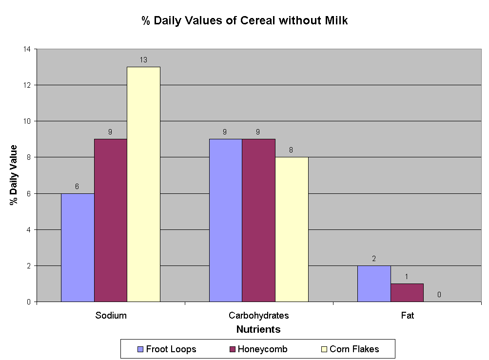
My Applied Mathematics curriculum is divided up into weeklong units designed by CORD. One of the units investigates tables and graphs. In the past, I have always had my students use paper and pencil methods to make their graphs and to take their tests. This year I added the use of EXCEL to make graphs from tables of data to the unit. At the beginning of the unit we explore many different types of graphs, such as circle graphs, horizontal and vertical bar graphs, and line graphs. Then I have my students make paper and pencil graphs. I want them to understand my basic requirements for a graph, such as putting on a title, labeling each axis with the proper units, making each axis is as uniform as possible, and putting down the proper information correctly. I have the students collect data for three types of breakfast cereals and make vertical bar graphs by hand to compare nutrient values of cereal with milk and cereal without milk.

These students are making paper and pencil graphs of nutrients in breakfast cereals.
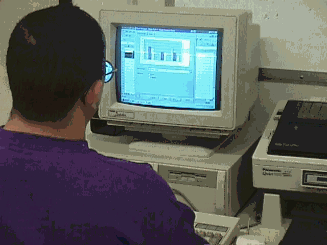
One change that I made this year was to have the students take the same data and make graphs using the EXCEL chart and graph wizard. One student’s graph appears below:

The students are also assigned a homework activity during the unit that requires some graphing. They are allowed to do the graphing by hand or by computer. The students may use a graphing program other than EXCEL if they have one at home, as this homework assignment is done outside of class. I am not concerned about which graphing technology is being used; I am concerned about whether or not the students chose to use the technology. This year at the end of the unit, I gave my students have the option of taking a traditional paper and pencil assessment, which includes making a paper and pencil graph, or an alternative assessment. In the alternative assessment, the students must examine three different groups of data, organize and present each group of data in a separate table, decide which type of graph would best represent each group of data, and print the graphs with a logical title and labels for all of the information.
The alternative assessment appears below:
Design the appropriate graph to represent the following information. Make sure that all graphs have titles and labels.
The students should know from the unit that question 1 is a circle graph, question 2 is a vertical or horizontal bar graph, and question 3 is a line graph. For question 3 the students must go to X-Y (scatter plot) in EXCEL to make the correct graph.

This student is taking the alternative assessment.
I taught this class twice this year with two different groups of students. The results of my study varied as the types of students in the two groups varied. In my first group of student, I had 6 students make positive comments towards using EXCEL for their homework, 2 students make negative comments towards using EXCEL for their homework and 2 students who were indifferent to using EXCEL for their homework. When it came time to take the test, 7 students took the alternative assessment and 5 took the traditional assessment. The average grade for the alternative assessments was 8.4 percent higher than the traditional assessment. In my other group, 4 of the five students were positive towards using EXCEL for their homework and the other student was indifferent. The same 4 students that were positive also took the alternative assessment, and the other student took the traditional assessment. This time the traditional assessment test score was higher than the average of the alternative assessment by 2.5 percent. The student who took the traditional test was also the person who had the highest average in the class going into the unit.
As the statistics show, a 5:1 ratio of students were positive towards using excel. Also 65% of the students chose to take the alternative assessment. This shows that the students want to engage in the use of technology when possible. It is fairly obvious that my sample groups are much too small to make many meaningful insights from my data. One statistic that is hard to reflect on paper is the attitude of the students when technology was introduced into the unit. This was the first unit that the students were able to go to the computer lab and work with this type of technology. The students appeared to be refreshed by getting out of the regular classroom and spending time using the computers. When a teacher does anything "new" or "different" in the classroom, most students will respond with enthusiasm. What we as teachers must measure is not just the enthusiasm, but if the implementation of the technology into the classroom had a positive effect on student learning.
The above selection is being sent to the National Council of Teachers of Mathematics publications department, which publishes The Mathematics Teacher. I know that you would also like to know about my training module and my MDU. Now that it is all said and done, I wish that I would have made my MDU topic the EXCEL graphing. I was more comfortable with my impact question, but I made my MDU to "get out of my box."
I taught my MDU, "The Greenhouse Effect," to my group of Applied Math students. There were 12 students in the class, and 10 of the 12 were very responsive to the unit. The other 2 students did not care to be within 50 feet of a school building, so they would not have really cared about anything that I would have taught them. The students started out the unit with being put into groups and each group presented about the Greenhouse Effect. Then the students worked with a Greenhouse experiment and used the data to explore the effect of global warming. Then the students compared atmospheres and temperatures of other planets to relate how the global warming affects the Earth. Both of my students who started the unit in an apathetic mood, became interested in the Greenhouse Effect when we started bringing out lights and thermometers and food storage bags for the experiment.
The students filled out a rubric to judge each other’s participation, effort, and work towards the goals of the unit. All of the students gave each other perfects scores on everything that they did. I know that some of the students’ efforts were less than perfect. At the end of the unit, I had my students write a letter to a newspaper telling about the effects about global warming and why it was important to stop damaging the atmosphere. I could tell from their letters that the students did increase their knowledge and appreciation of the Greenhouse Effect. I gave the students the option of actually sending their letters to a newspaper, but none of them wanted their letters sent.
In my training module, I cooperated with two other teachers from Madison High School, Darren Swenson and Steve Swann, to assist other teachers in developing a web page for themselves. We went through some of the same basic steps as our instructors had gone through with us when we developed web pages at TTL. We had six teachers participate. All of them were pleased with the increased knowledge base and some of them have further increased their knowledge by asking us to work with them to further develop their web pages throughout the school year. I feel that the three of us were successful in the implementation of our training module.